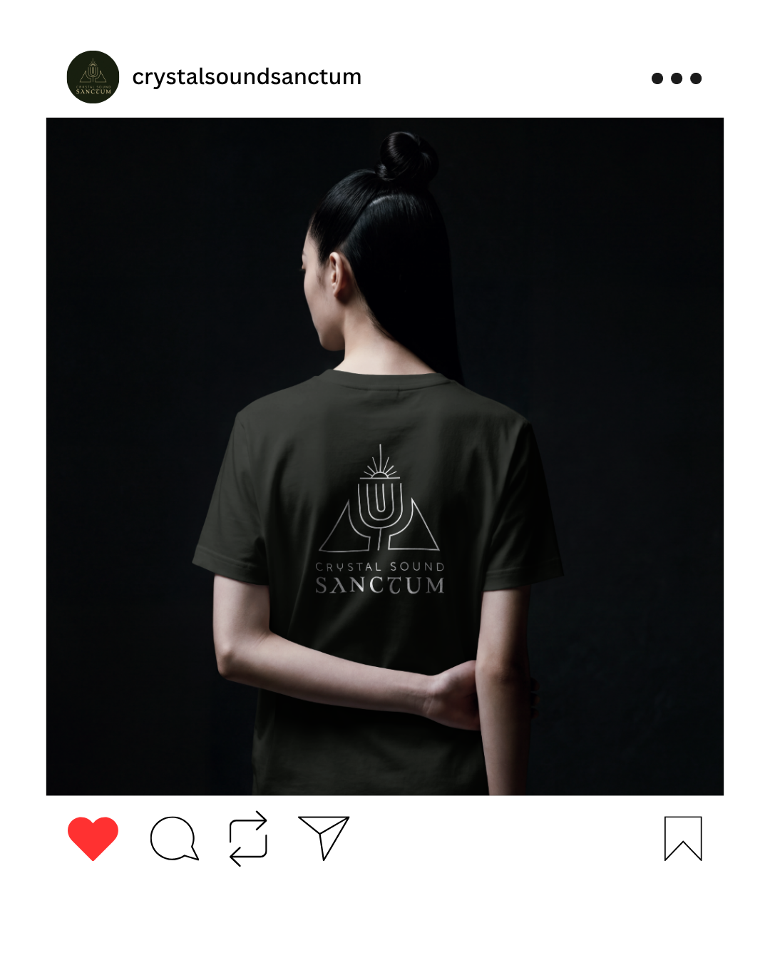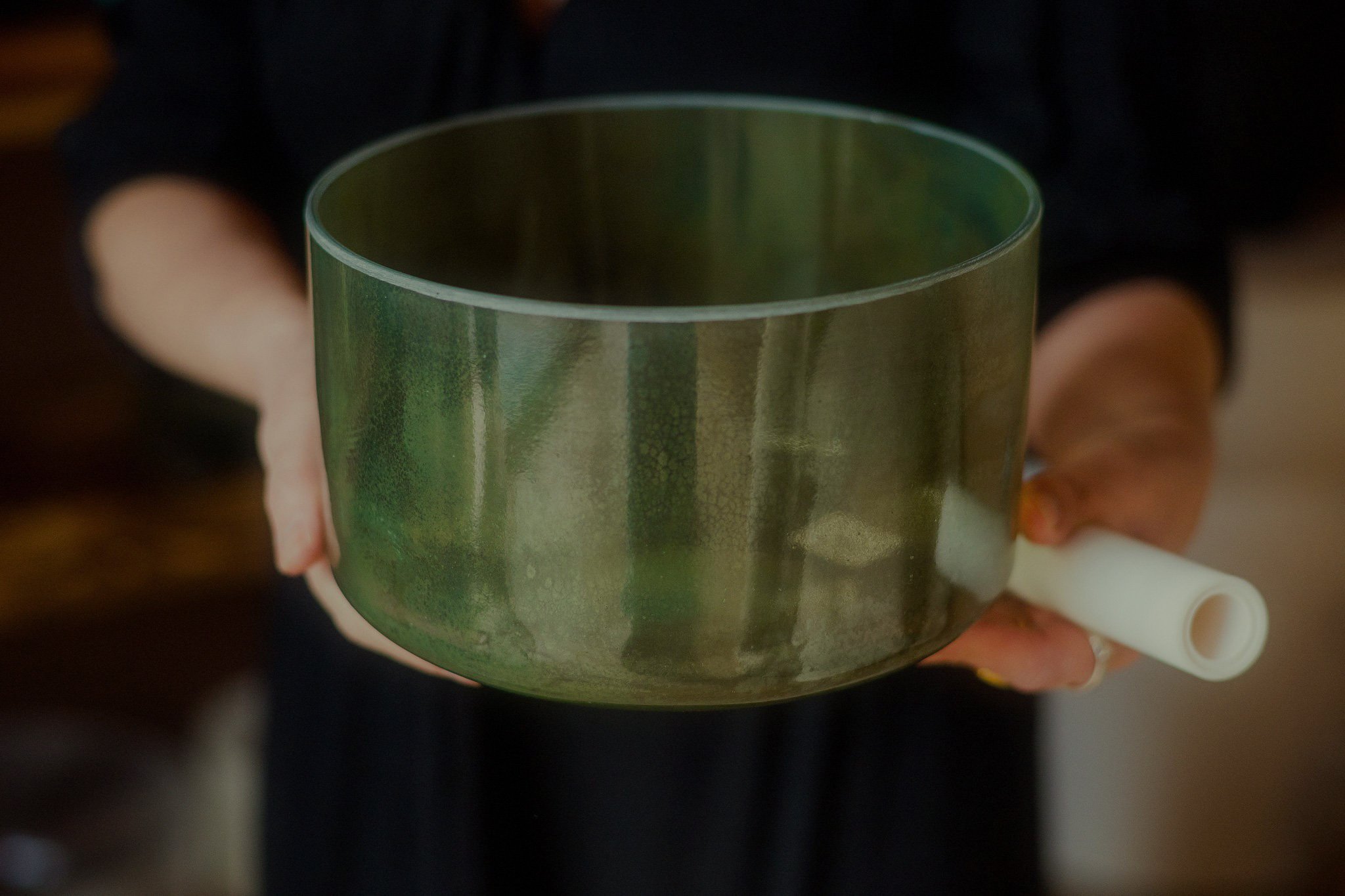
OVERVIEW
CLIENT: Crystal Sound Sanctum
SECTOR: Wellbeing, Luxury goods
DELIVERABLES: Logo design
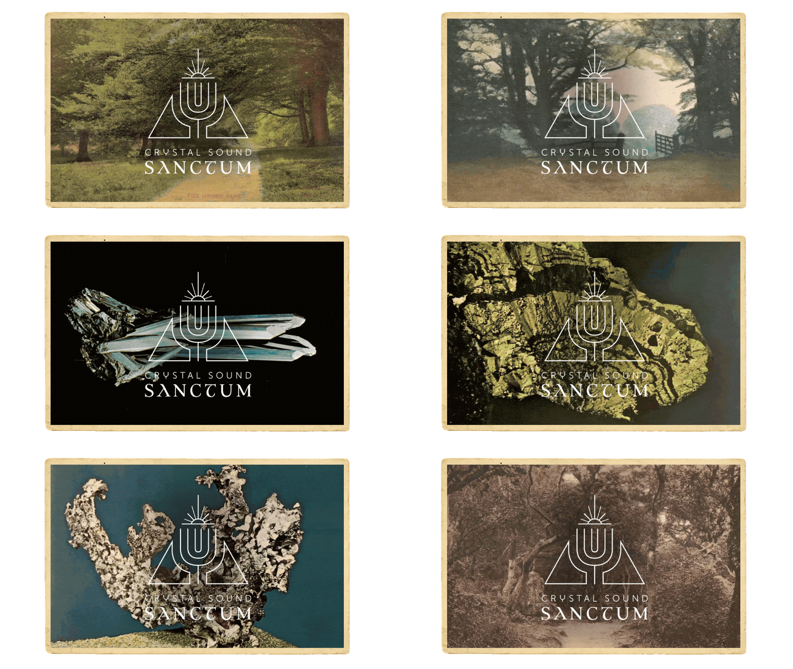
ABOUT: Crystal Sound Sanctum wanted to connect with their forest roots in South Wales and the Cotswolds to bring a witchy earthiness to the world of sound healing. Hosting events and as resellers of high-end crystal singing bowls, they needed a logo that looked refined enough for a luxury product brand, whilst still conveying a sense of the spiritual to reflect their ‘Pagan Luxe’ vibe.
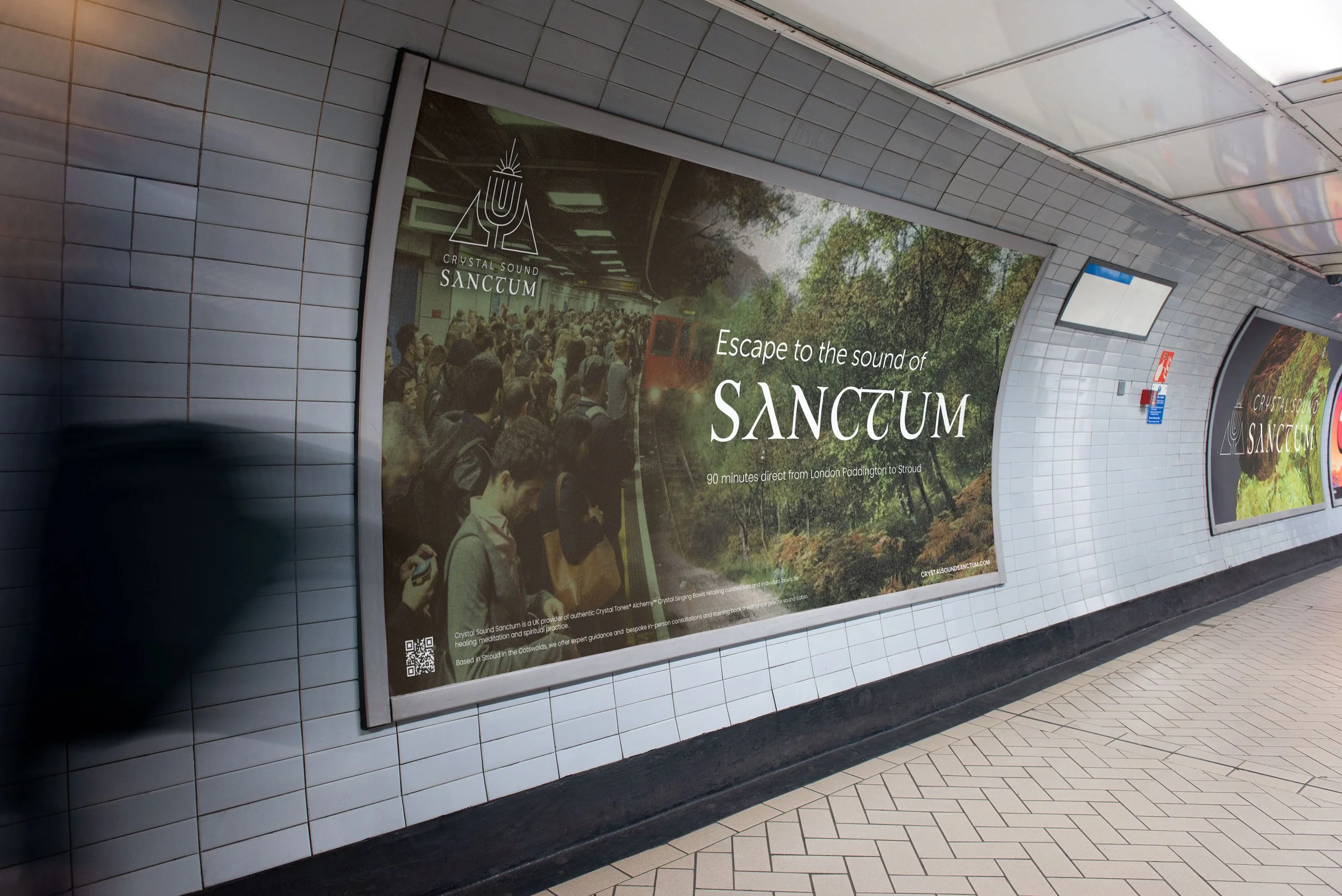
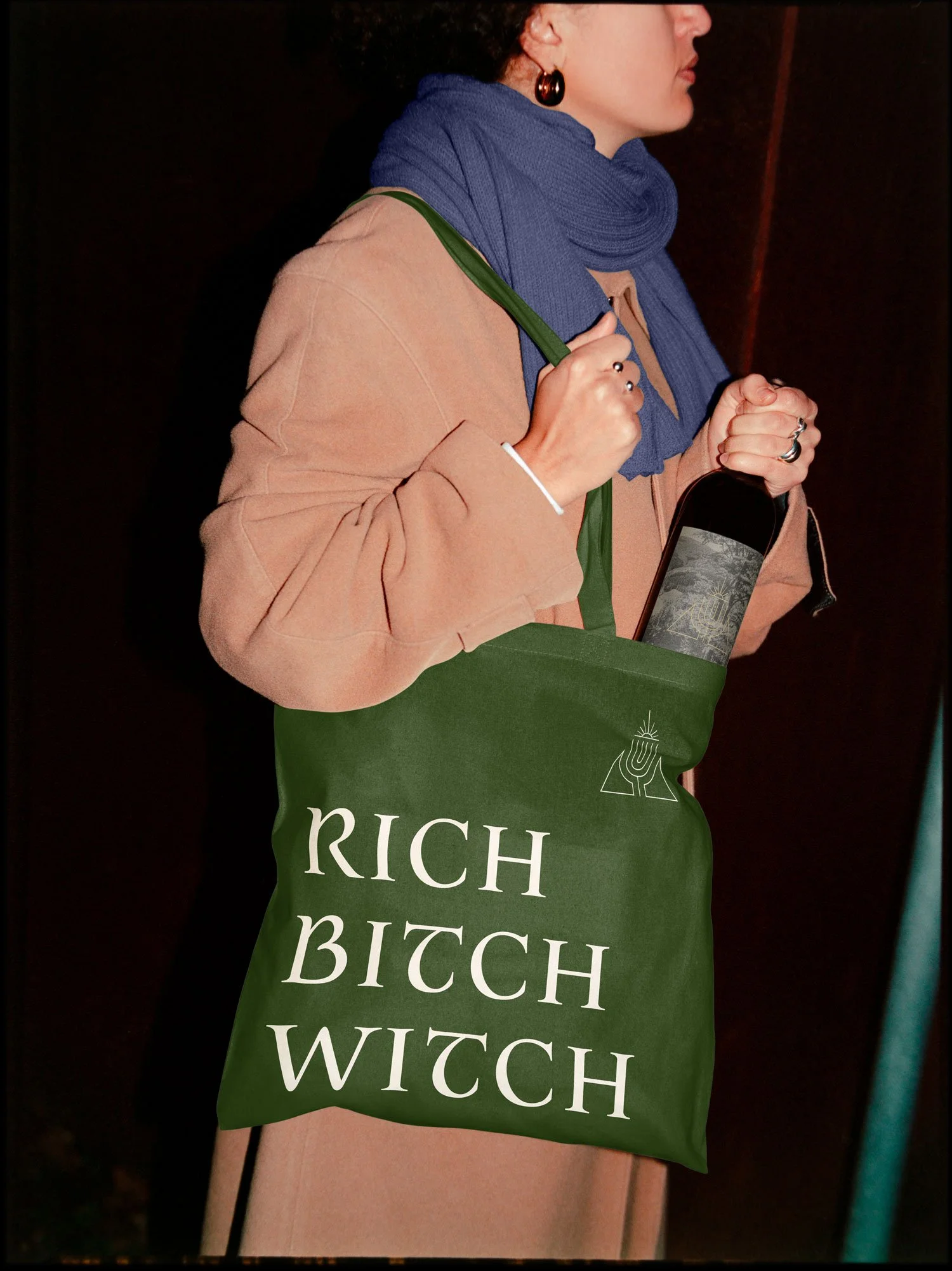
The story behind the symbol
The founders wanted a logo that was deeply symbolic, telling the story of the brand whilst remaining simple and chic.
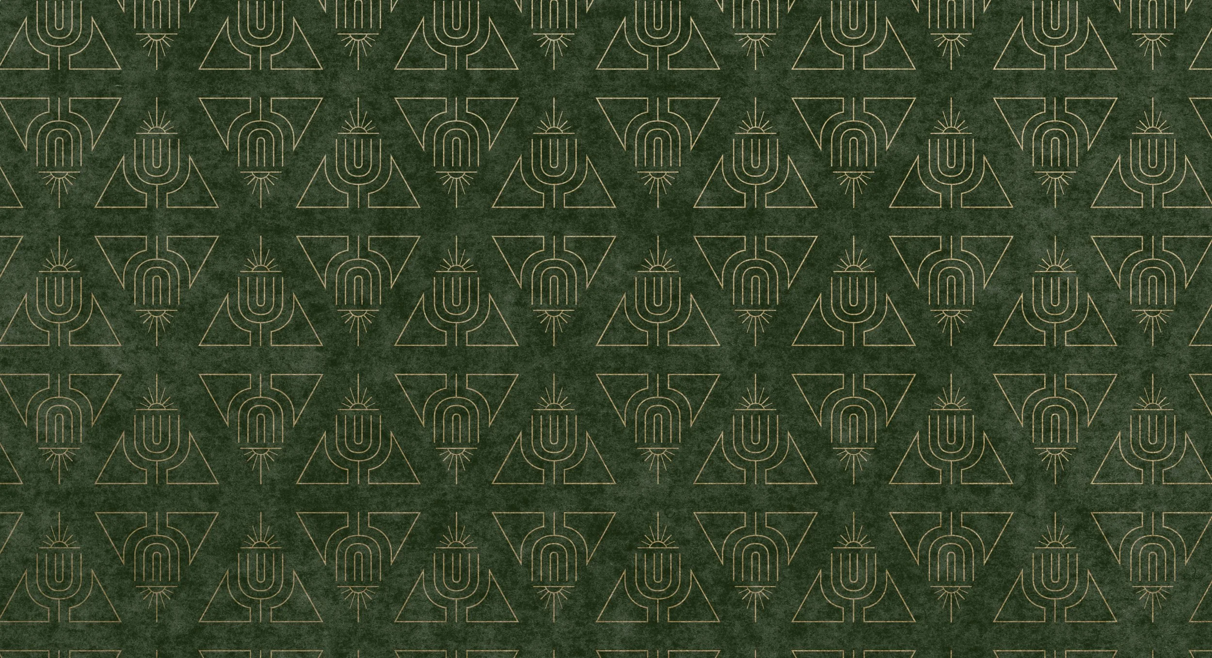
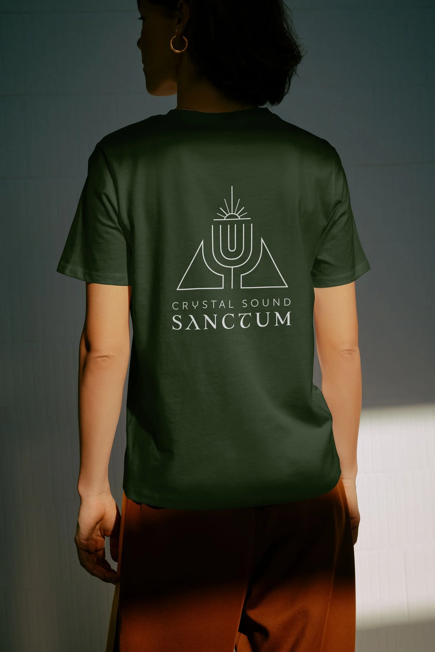
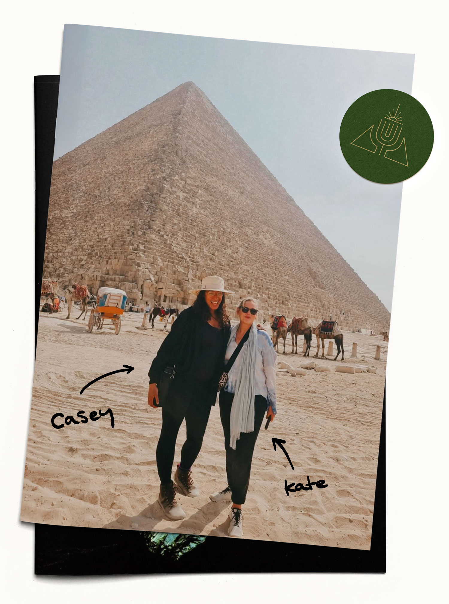
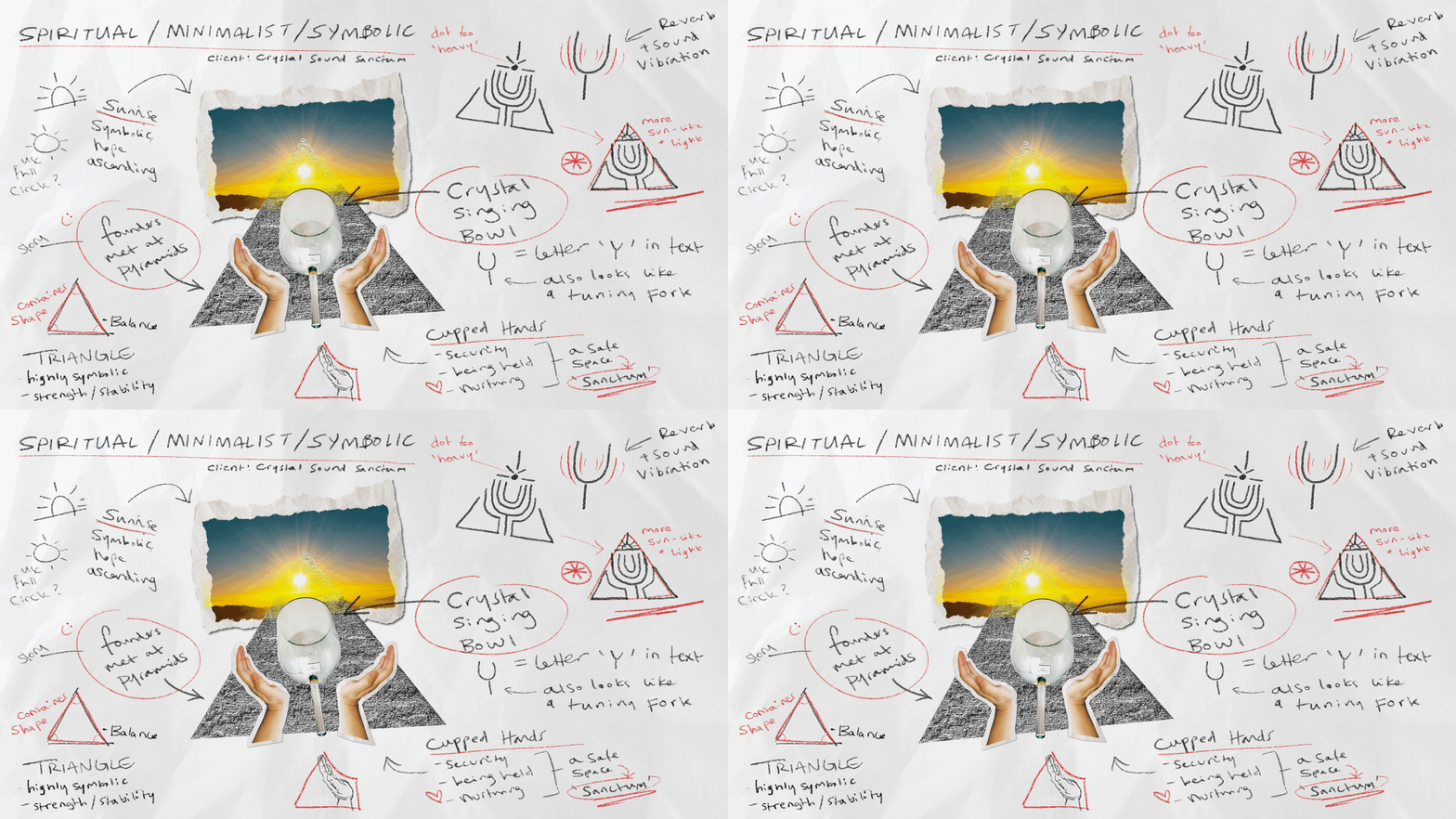
The design started at the same place the founders met - on a pilgrimage to the pyramids. Using the triangular form as the foundation of the logo, it not only represented the landmark but also a sense of balance, harmony and enclosure, all qualities you’d want associated with a sound healing sanctuary.
I incorporated the shape of a singing bowl / tuning fork in the centre of the design, with repeating forms to represent the sound vibrations. The curvature this forms within the pyramid also echoes the shape of cupped hands, to give a sense of nurturing support and being ‘held’.
Finally, rather than leaving the tip of the pyramid as a simple point, a sun symbol was included to represent the sunrise, ascension and a sense of transformation and new beginnings.

“She has an intuitive ability to put your vision into meaningful marketing…”
Joanna has been my go-to designer for over 10 years, helping me to develop and maintain the identity and visual style for my businesses.
She has an intuitive ability to put your vision into meaningful marketing, capture the personality of a brand, and promote that in clear, captivating visuals.
KATE LEWIS
Co-Founder, Crystal Sound Sanctum
A simple yet symbolic design that needed to look equal parts Hermès and Hobbit.
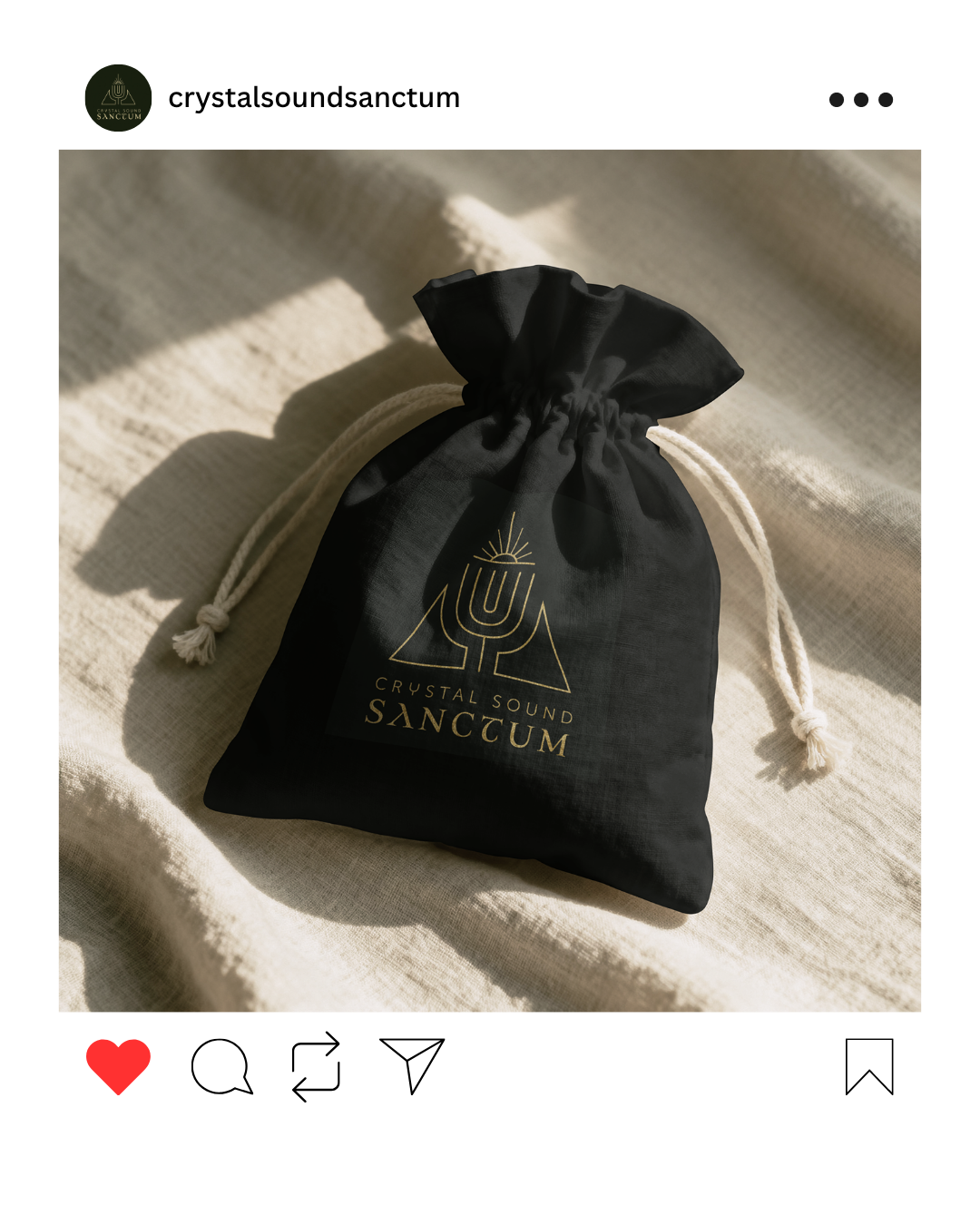
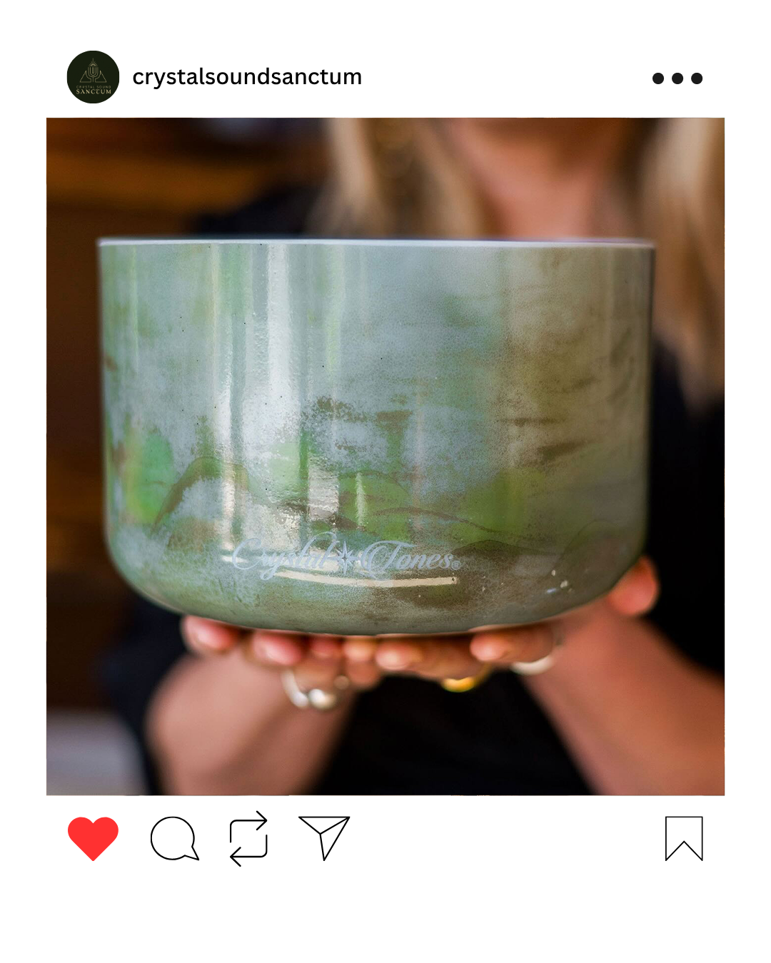
The business needed to be set up as a partner of Crystal Tones® singing bowls, so the founders wanted a professional identity to pitch before developing a full brand package.
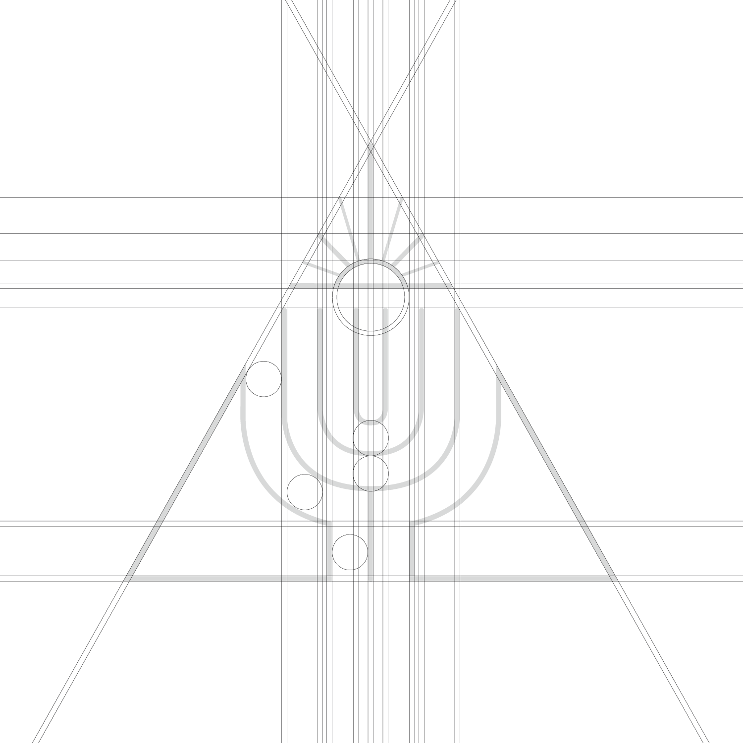
After considering the visual elements that told the story, I used a slim, single line weight throughout the logo to keep the design looking refined and unfussy. Slightly thinner lines were used alternately in the condensed point of the ‘sunbeam’ to create balance and prevent the design from looking too top-heavy.
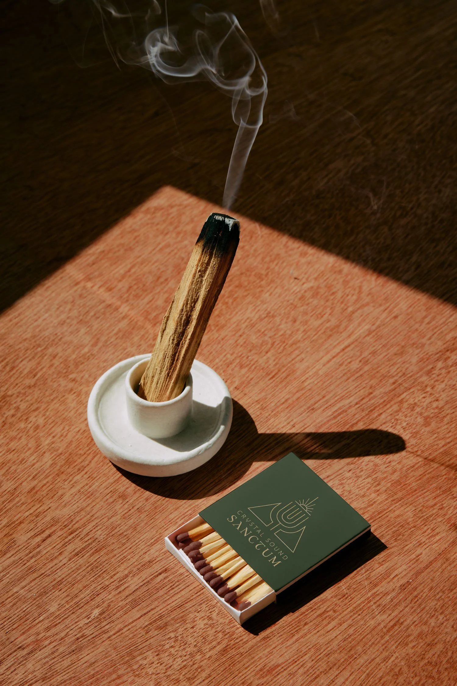
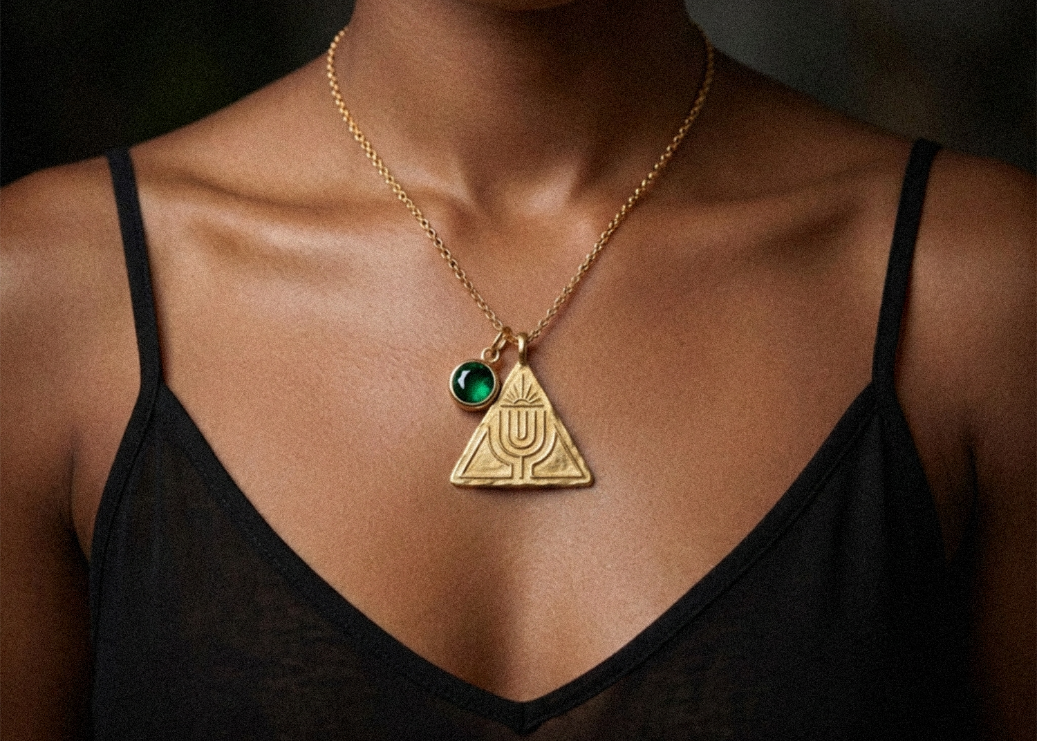
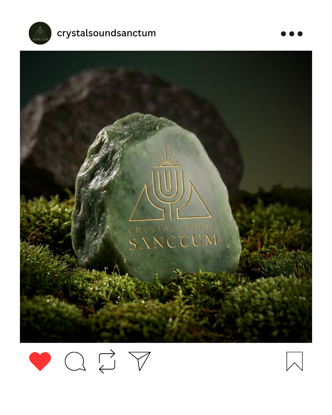
The logo was designed to work in silhouette form, so it could compliment being used alongside product images which featured multiple colours, without clashing or competing.
As with the nature of sound healing, the finished logo form is one which is harmonious, balancing and holds space.