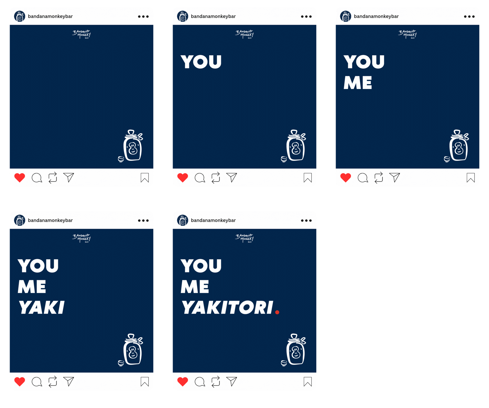
OVERVIEW
CLIENT: Bandana Monkey Bar / Andrew Kojima
SECTOR: Food & Drink, Hospitality
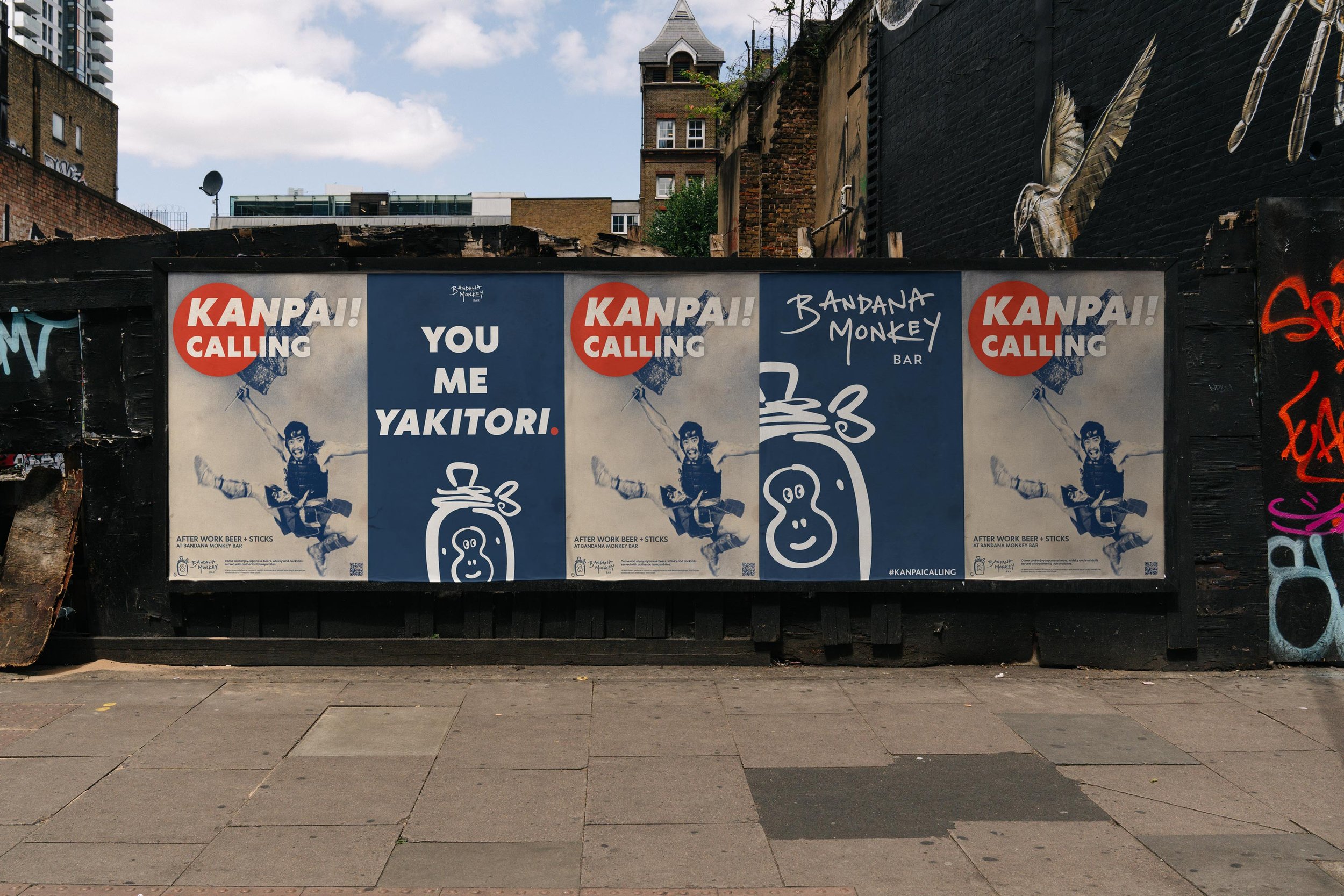
DELIVERABLES: Logo design (commissioned), promotional graphics (concept)
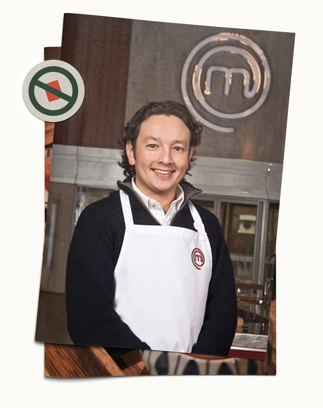
ABOUT: Bandana Monkey Bar was a concept developed in 2017 by Masterchef finalist Andrew Kojima to bring the Japanese Izakaya style of casual drinking and dining to the UK, showcasing the variety of food that was available beyond sushi. Having worked together previously on the branding for his debut restaurant in Cheltenham, I was asked to develop a logo to aid the pitching process. Sadly the bar never made it past the idea stage, but having always held a soft spot for the cheeky-monkey logo (and Japanese food…) I decided to revisit it as a personal project.
“No Sushi”: a master-chef’s mission to end the maki monopoly
In 2017, mainstream Japanese food in the UK was still largely limited to sushi, ramen, and a few big chains.
After reaching the Masterchef final, chef Andrew 'Koj' Kojima opened his first restaurant in Cheltenham and asked me to create a 'No Sushi' brand, reflecting his aim to showcase Japan's wider culinary range.
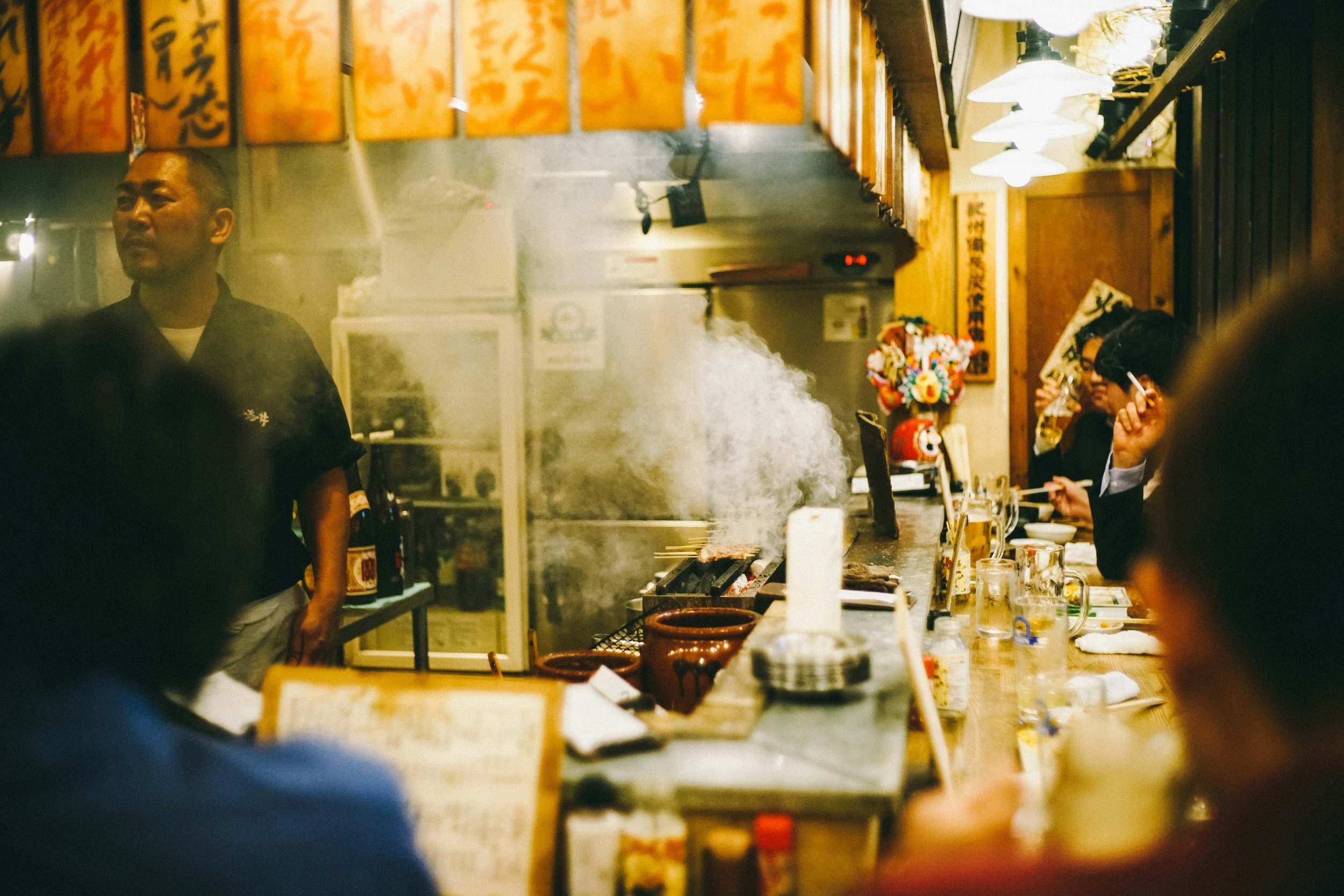
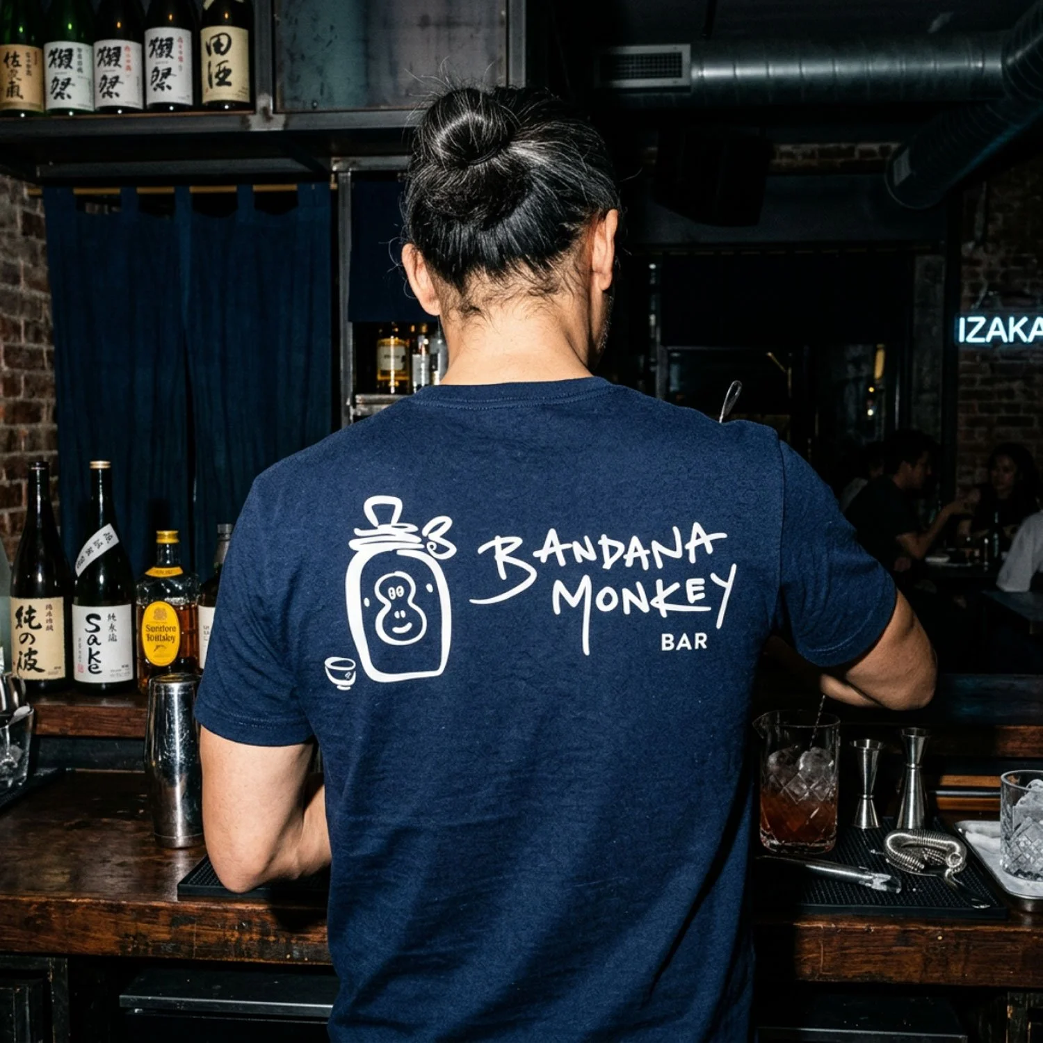
He later planned a sister venue, Bandana Monkey Bar, a more relaxed, Izakaya-style spot for drinks and sharing plates - the kind of place you drop in after work with friends, end up staying for hours later (and then somehow end up at a karaoke bar).
I was asked again to develop a brand identity, and with my own half-British, half-Japanese heritage, this project felt particularly close to my heart, but sadly, it never progressed beyond the logo due to the pandemic's impact on hospitality.
However, the logo concept was one I remained fond of, and felt it deserved a home outside the archives of my hard drive.
Incorporating existing assets to make it a sister, not separate, brand.
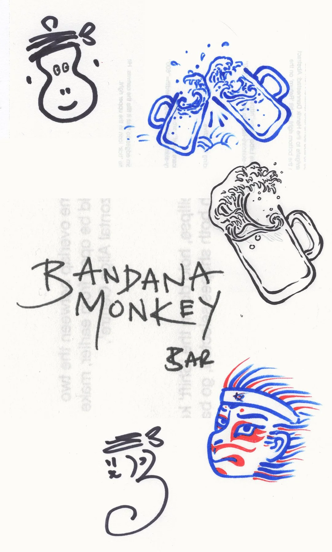
Andrew already had his personal ‘Koj’ logo established, which he wanted incorporated into the design.
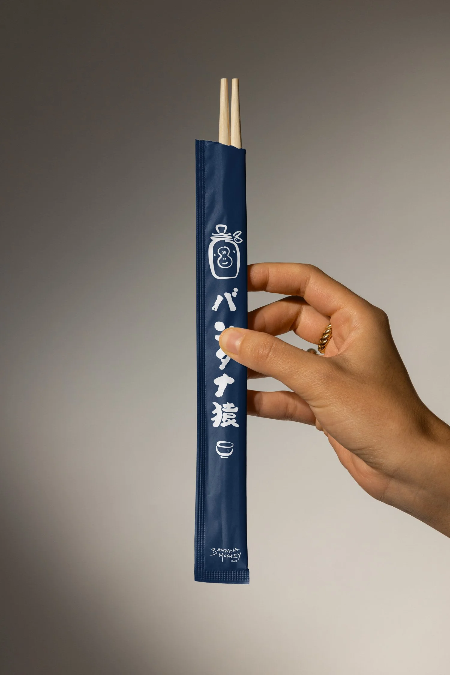
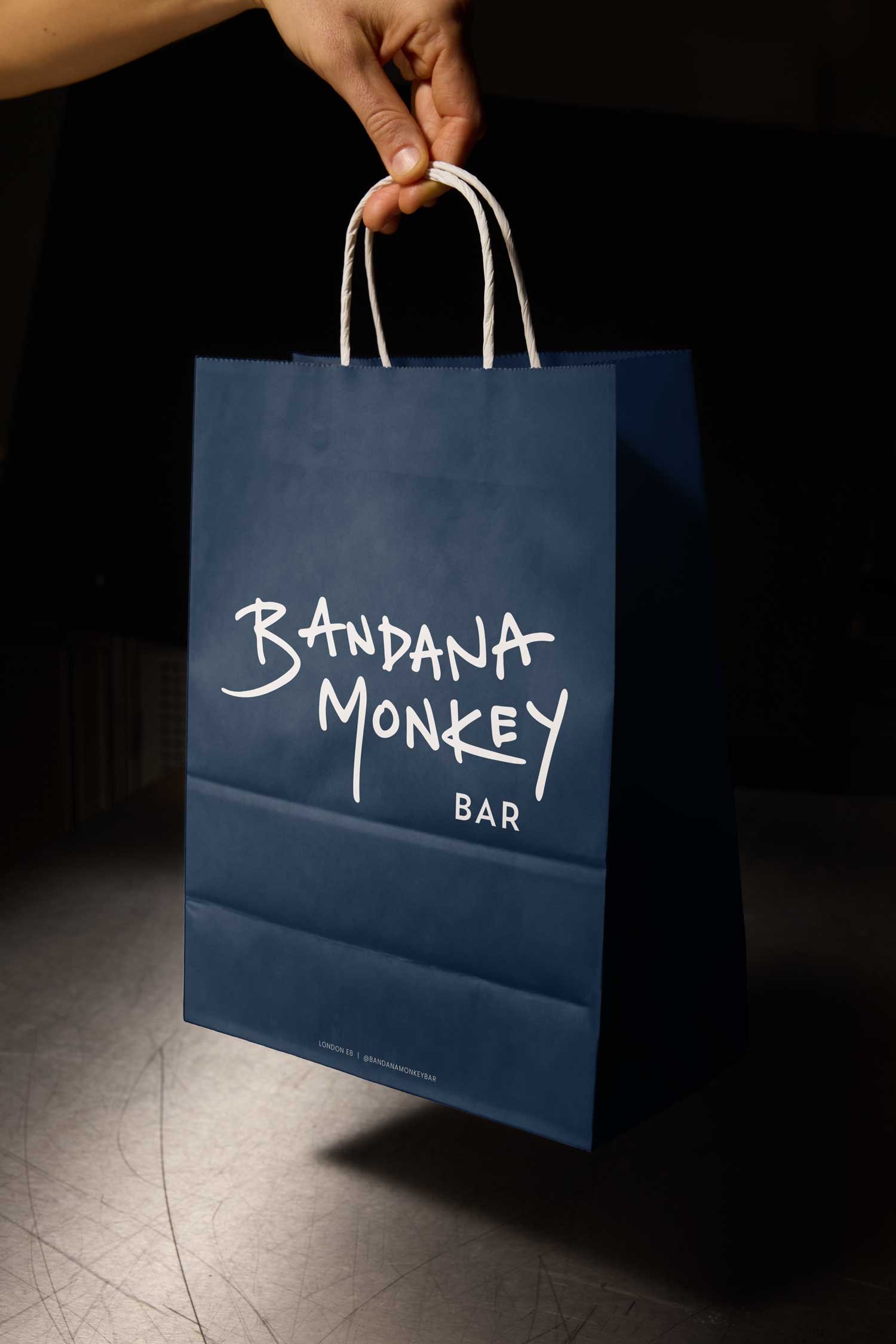
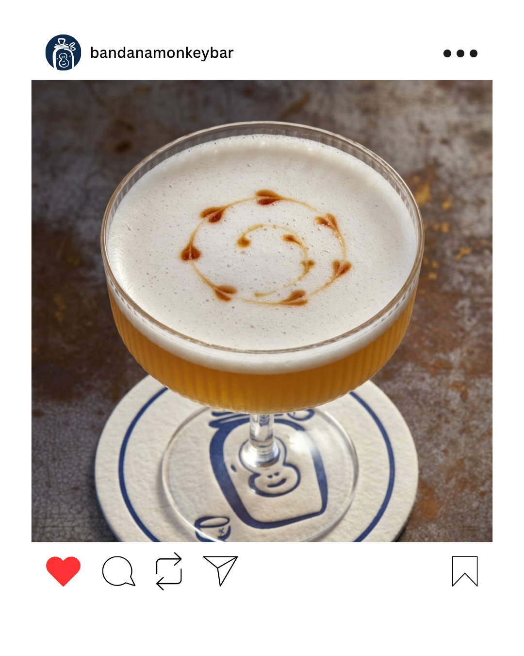
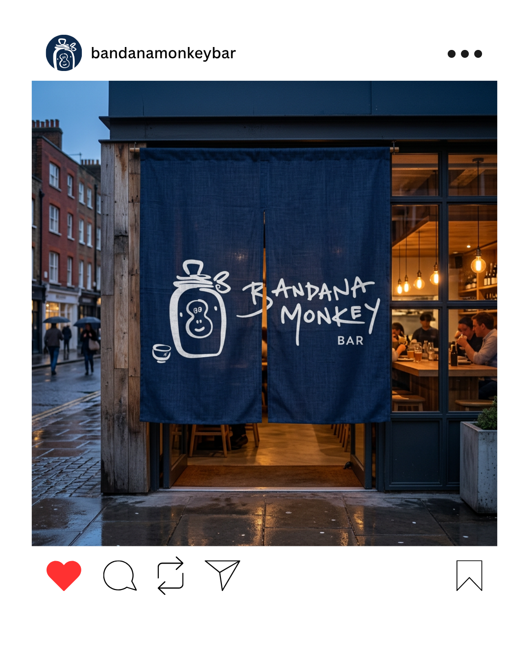
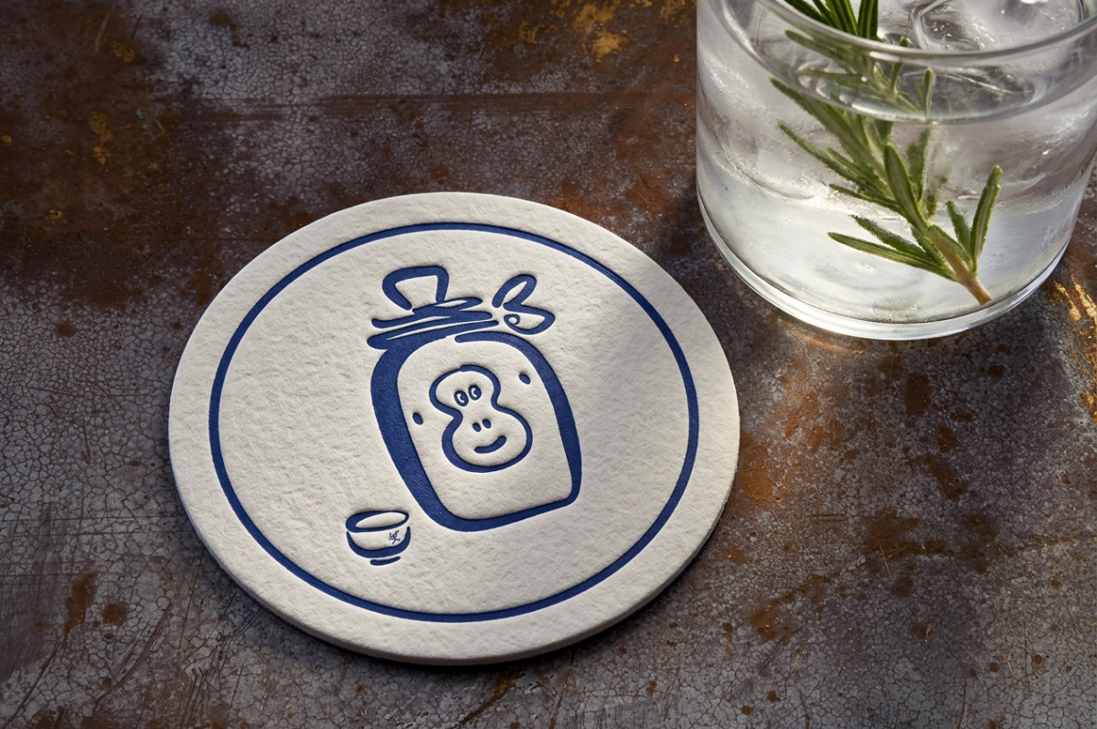
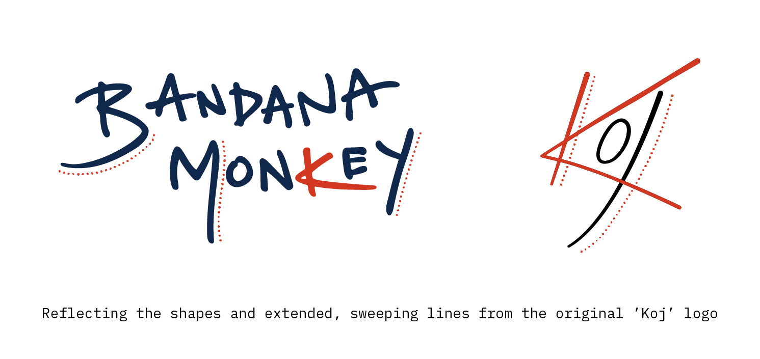
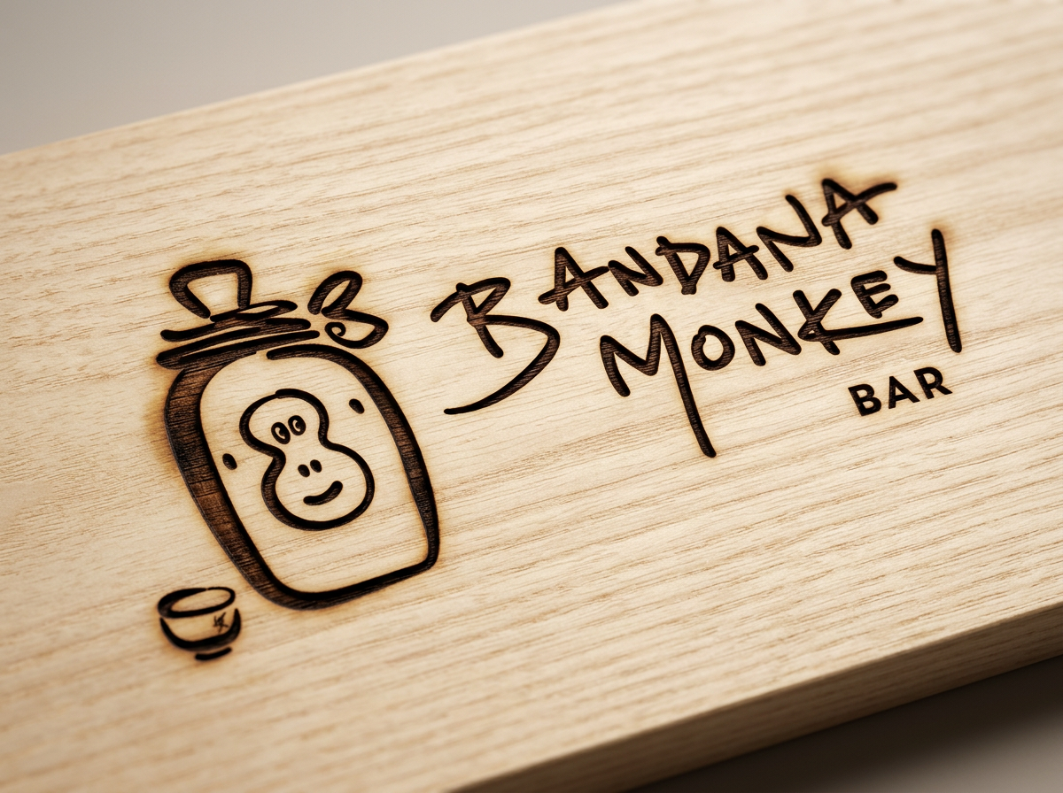
This was approached in two ways: firstly by including the logo as a subtle, branded mark on the sake cup, and also by creating a bespoke, handwritten wordmark that reflected the long sweeping lines of the original ‘Koj’ logo and mimicking the shape of the ‘K’.
A slightly thicker, uneven line was used to mimic the handwritten type and reflect the more casual, relaxed nature of the bar.
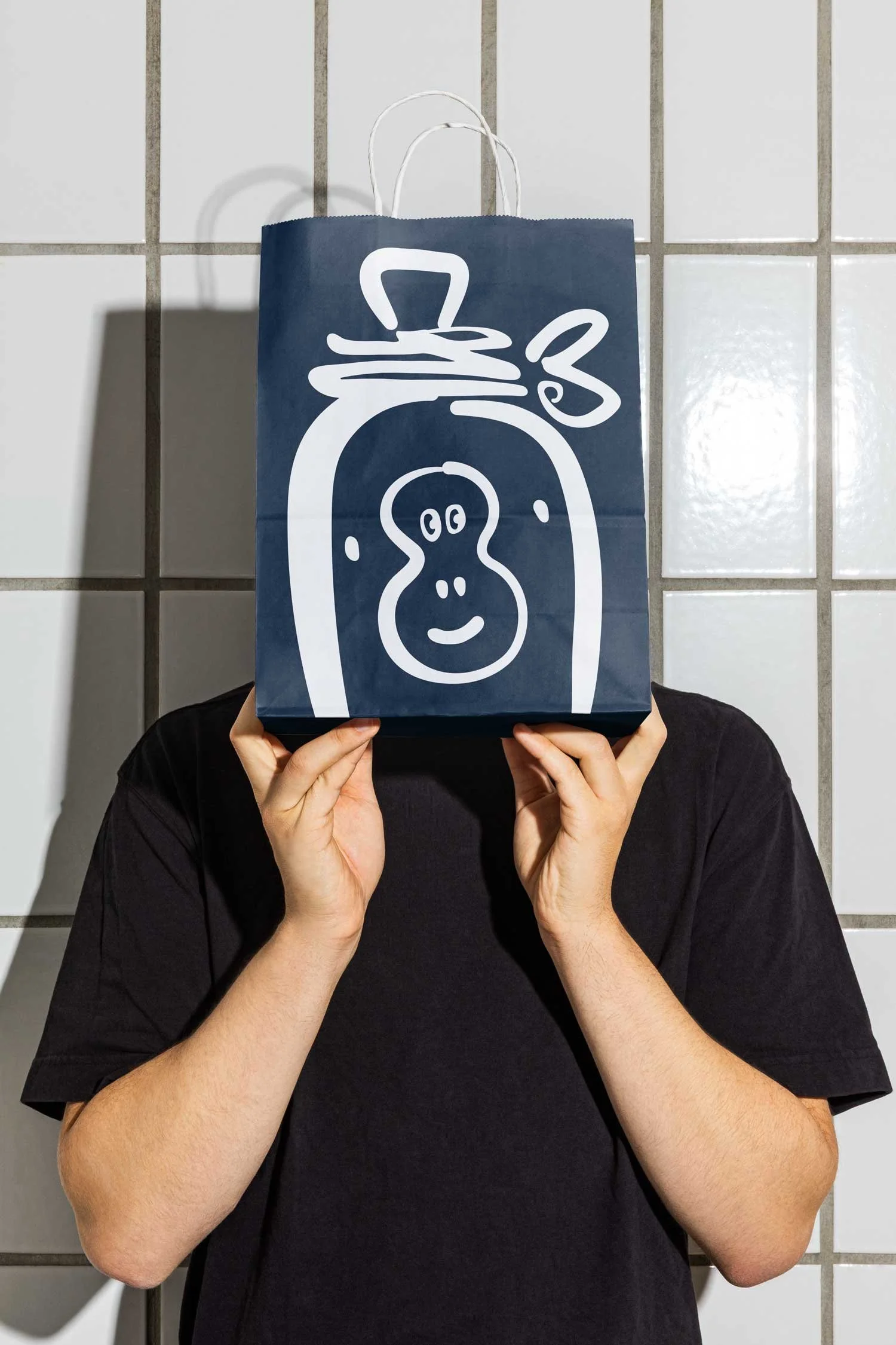
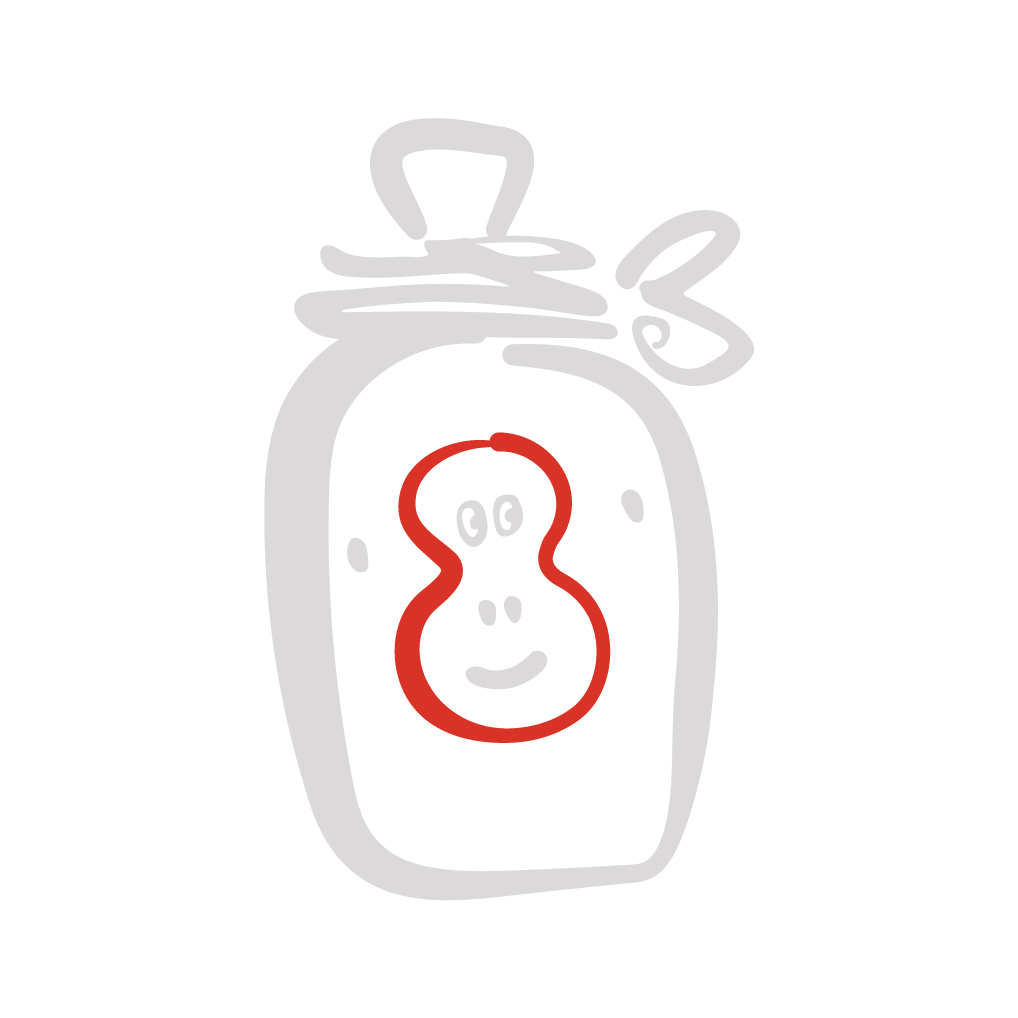
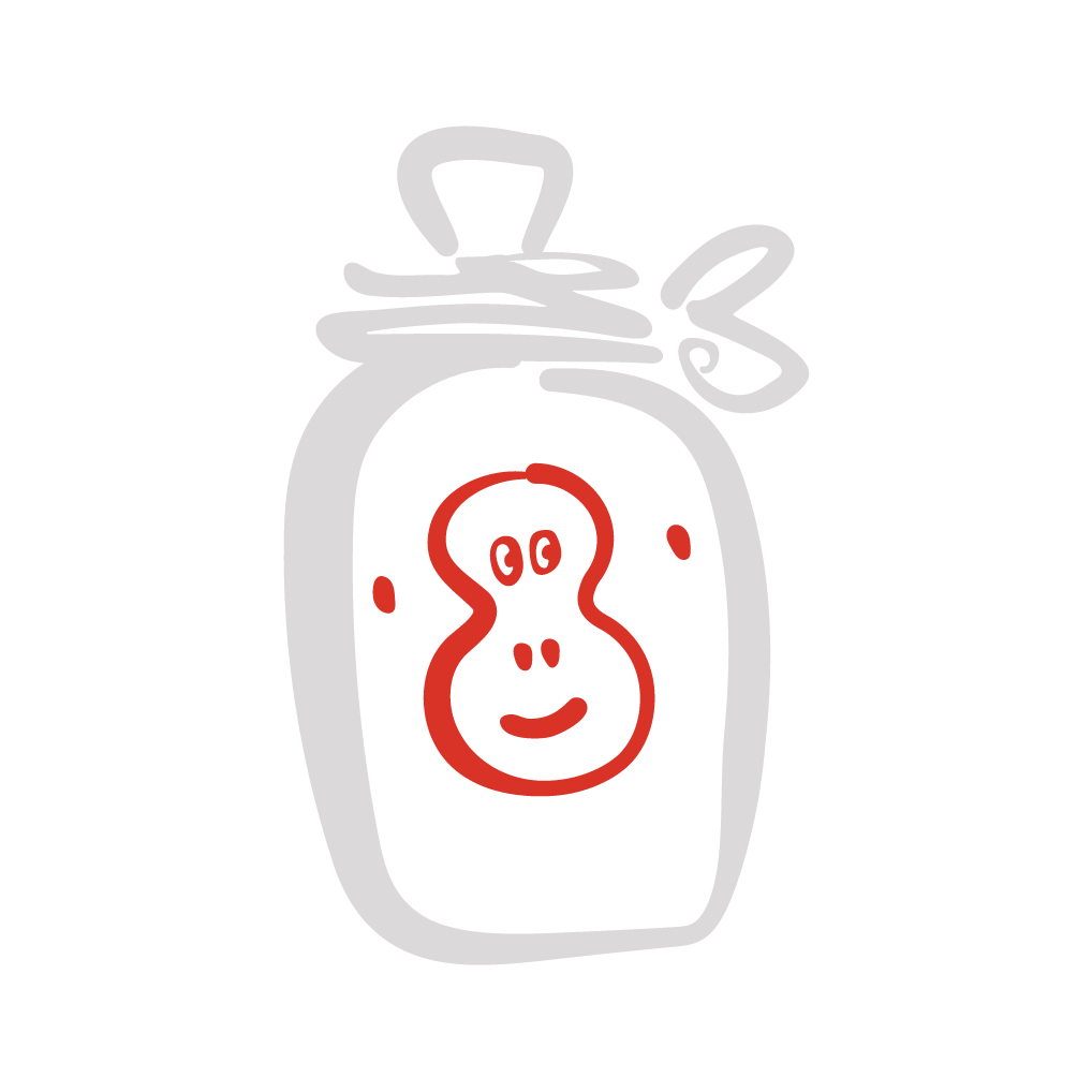
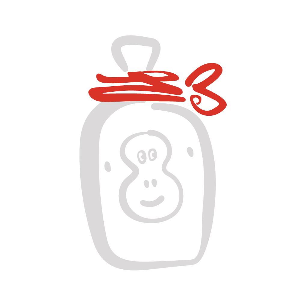
Creating ‘Sake Zaru’: the bar’s friendly monkey mascot 🐒
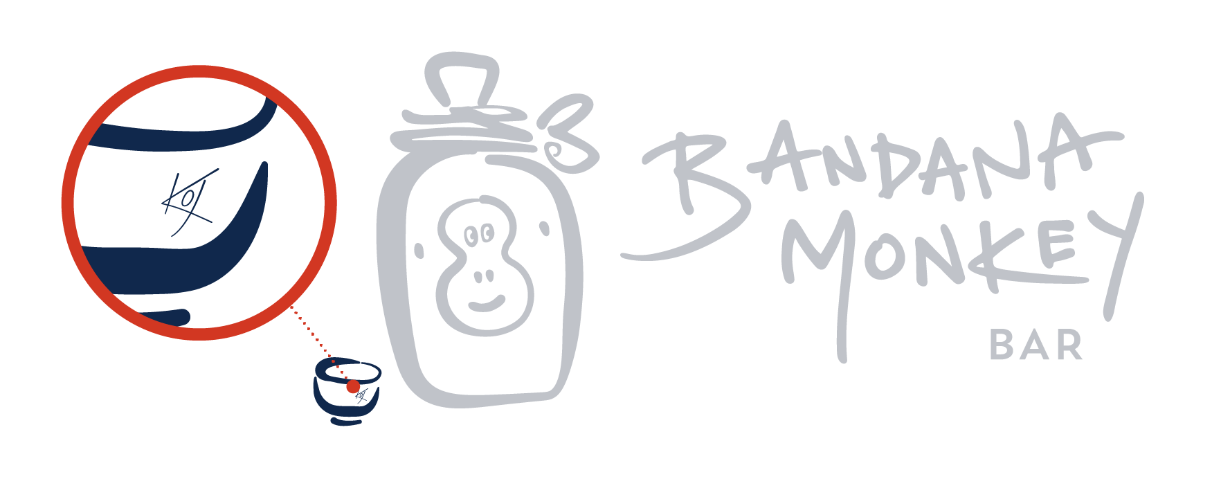
The monkey icon needed to be central to the bar’s identity - after all, he’s in the name!
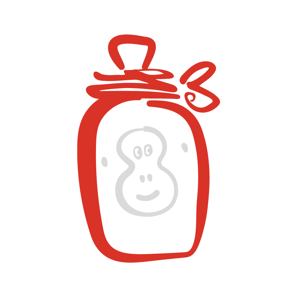
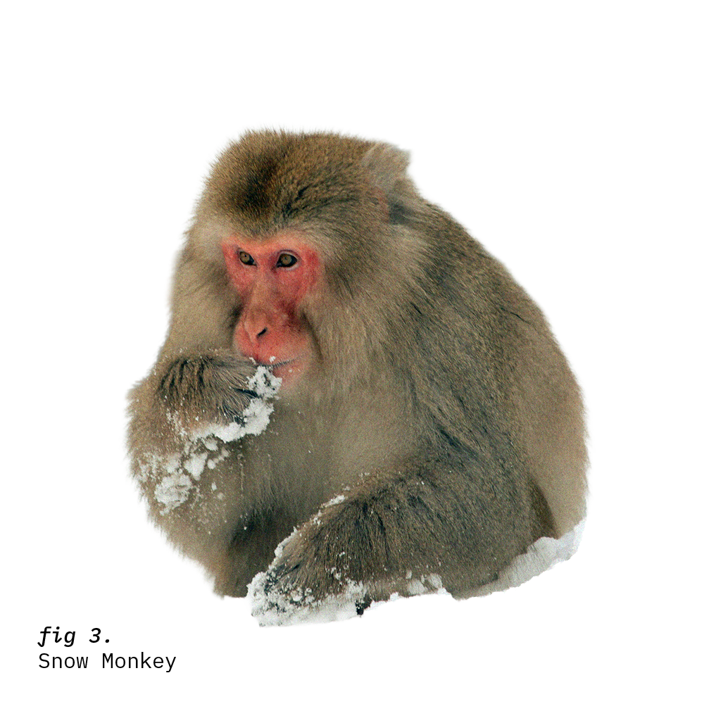
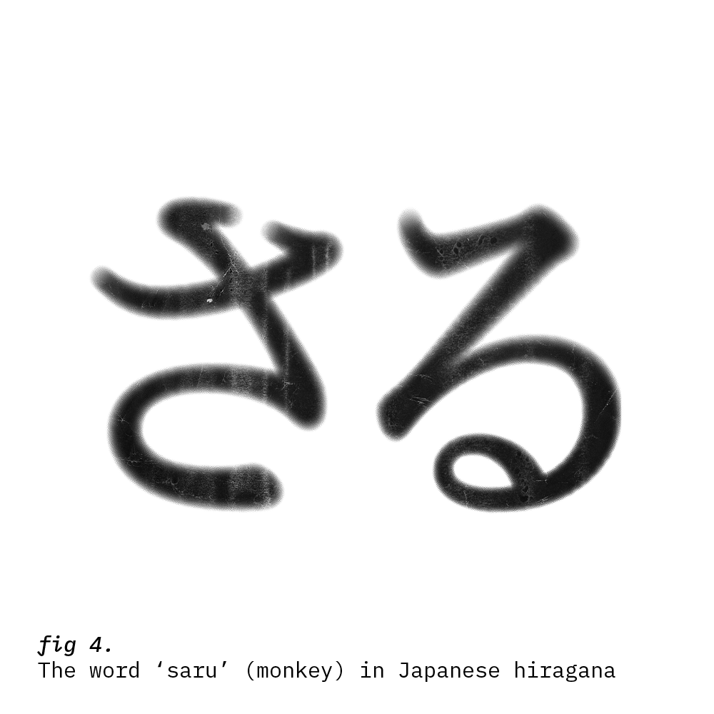
A monkey wearing a bandana was already a distinct image in itself, but I wanted to avoid the obvious route (‘monkey in a headscarf’ - bosh!) and incorporate more of a story for people to find - reflecting the playful, inviting nature of the brand. It was also an opportunity to tie it back to its Japanese heritage, using references that felt evocative and familiar.
A welcoming sense of place.
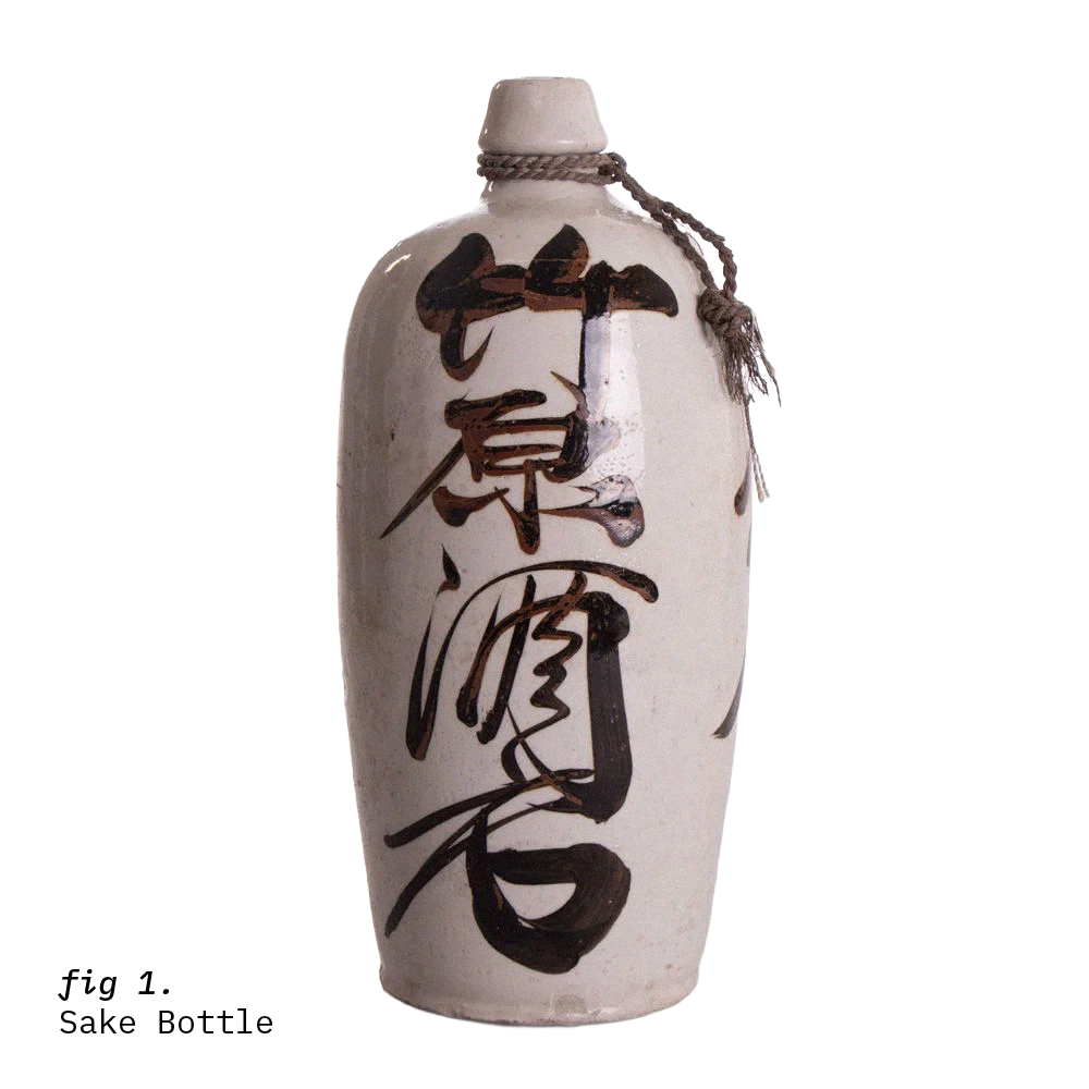
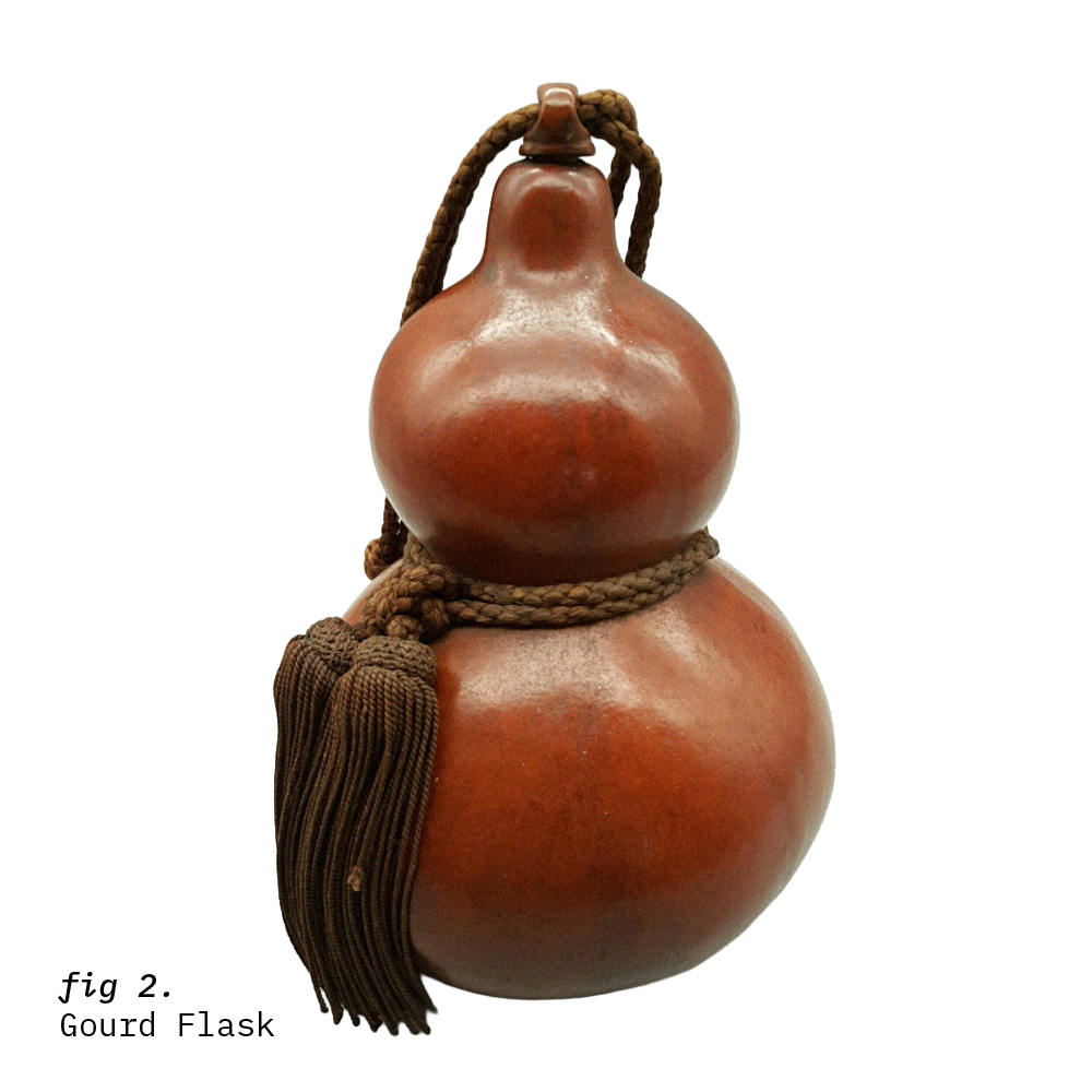
This logo always felt close to my heart because I was able to pull on references from my own childhood in Tokyo - remembering the big, stone sake bottles that sat in my grandparents’ kitchen, and the decorative rope tied around the neck.
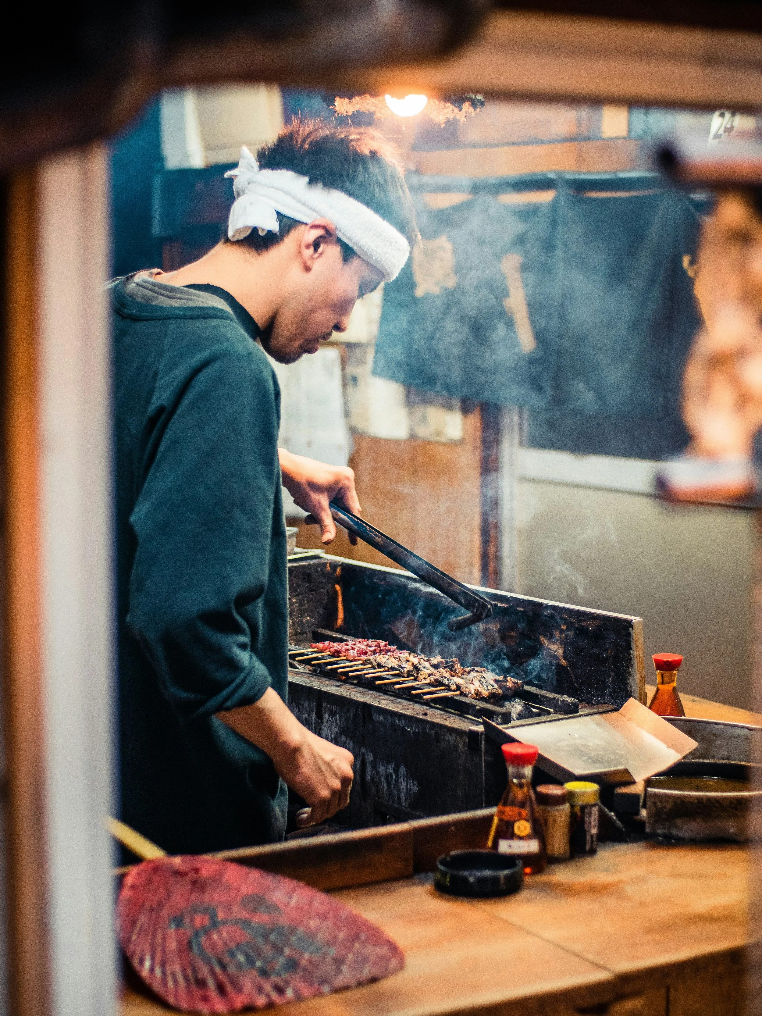
The local family-owned restaurants we’d eat at, with the chefs wearing their ‘hachimaki’ head wraps, smiling and shouting “irashai-mase!” (“welcome!”)from behind the bar.
I wanted to bring that sense of warmth and friendliness to the logo, and convey a genuine love for Japan. Something that reflected the everyday lived experience of communities, and avoided clichéd imagery whilst still feeling familiar and recognisable enough to a UK audience.
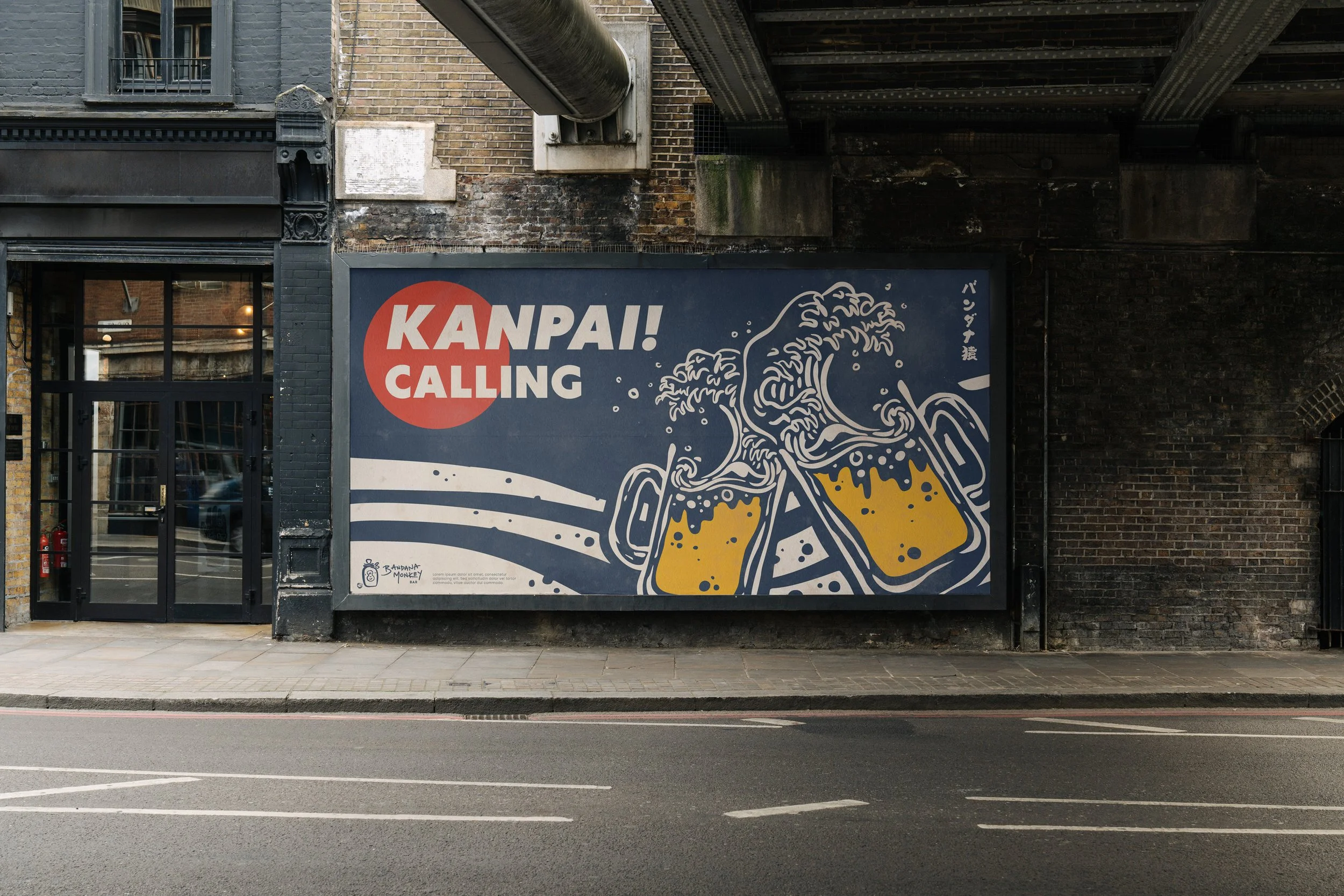
Somewhere unpretentious, welcoming and where everyone can join in with a “kanpai!” (“cheers!”) with friends.